Factory Forms Demo
Making Copies in the Age of Automation
Contents: Layers | Registration | Errors | Resonances
Layers
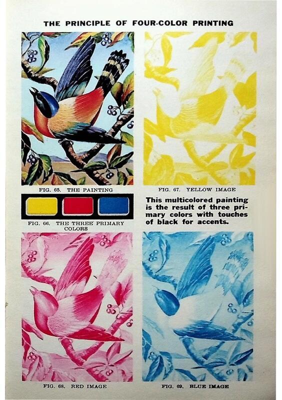
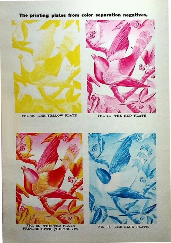
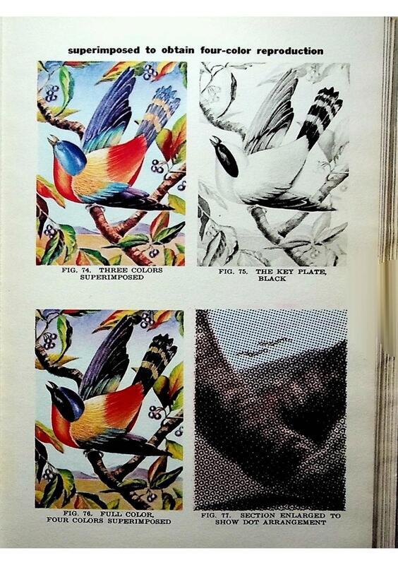
Layering, the process of separating colors into different registers and layering them atop one another, emerged independently in this and in many other contexts: in the multi-colored block printing of South Asian textiles; in the Renaissance chiaroscuro print; in the eighteenth-century Japanese wood-block printing process called ukiyo-e; in the hand-stenciling of dyes onto picture postcards and children’s books in nineteenth century Europe. For the past few centuries, multicolor printing on paper has typically followed the same rough scheme: printers prepare a separate matrix for each color, with each block the same dimensions. They then press these blocks in succession onto the printing stock. If printers manage to correctly align these multiple layers, they can produce the impression of a single, cohesive image comprising several colors.
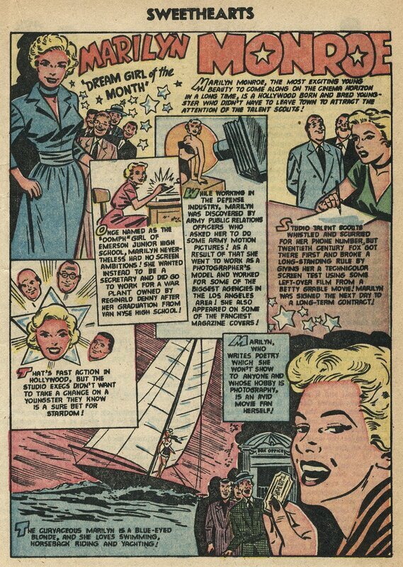
By World War II, layering processes structured nearly all color printing: the relief printing of newspapers and comic books, the rotogravure printing of magazines, the screen printing of advertising and public signage, and even color motion picture film. The earliest and most important color cinema processes used layers; both Technicolor and its many predecessors drew explicitly on color printing techniques developed in the graphic arts.
Whatever the form of color separation used, separate monochromatic images still had to be recombined—layered—in alignment. In many single-sheet processes, maintaining even color registration was a delicate, manual process that involved on-the-fly decision making.
Registration
An important tool for detecting and measuring the alignment of layers emerged in the “registration mark.” This small, unobtrusive symbol is often found in the margins of colored prints; one can easily find examples of it today in the lower corners of many color newspapers and magazines, on the selvedge of uncut fabric, and on inner flaps of printed packaging. In the 20th century, registration marks came to resemble the crosshairs found in a gun-sight. As in target shooting, single-sheet printing required a coordination of the optic and the haptic, the alignment of a technology (the gun; the printing press) with a receptive surface (the target; the printing stock). But unlike other printers’ tools—pins, paper flaps, even vacuums—used to hold the printing stock in place, the registration mark became useful not during, but after, the moment of impression. Shoot blind, measure how closely you have hit your target, adjust, and then shoot again.
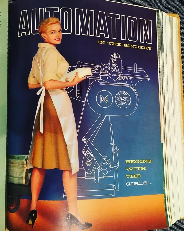
In the middle of the Nineteenth Century, many presses stopped printing on single sheets; instead, long ribbons of paper flowed continuously flowed through a series of cylindrical printing forms. This process became known as “web printing” for these long spools, or “webs,” of paper. (figures 2.16 – 2.18) By the early Twentieth Century, web printing was the dominant mode of pressroom organization. Color newspapers, magazines, illustrated books, and comics were all printed on long rolls of paper that unspooled through a series of rotary presses, like the constantly moving conveyor belt of a factory assembly line.
Web printing required machines and press operators who could work in concert to regularly space discrete impressions along a continuous, moving surface—almost like a roll of motion picture film. If images were spaced unevenly along a web of paper, then after cutting and folding impressions would appear on the page off-center or even truncated, as on sheets of misperforated stamps. (figure 2.19) Color web printing required the same precision timing, but with narrower tolerances, and four times over: separate impressions in cyan, magenta, yellow, and black together made up the standard four-color (or CMYK) process. In these cases, paper webs flowed through multi-cylinder presses with separate matrices for each color of ink. (figures 2.20-2.21) In order to ensure the seamlessness cohesion of these layers, printers had to manage a set of dynamic relations between the discrete unit of the page and the continuous flow of the paper web. They did this by making sure that the matrix repeatedly made its percussive impact on the page at the right moment—by ensuring their machines could keep a beat in time.
It is easy to imagine that an ideally calibrated machine could keep this beat perfectly. The ideal machine would perfectly pace the flow of the paper web to the movement of the printing cylinder; it would place each color state precisely on top of the last, and each successive image equidistant from the next. Yet this ideal machine is just that—an ideal that lay far from reality.
Errors
Many publications also ran on narrow enough profit margins to neglect the elaborate back-and-forth processes of generating proofs and modifying press settings to correct errors. In 1954, Harold Chamberlain, a printer and distributor of comics, admitted to a U.S Congressional hearing that he did not even run proofs; by his own account, the first time he saw each magazine was after it had been printed.
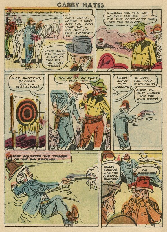
Comic books provided one medium for the broad circulation and preservation of spectacular printing errors: one example from a 1956 issue of the comic book Gabby Hayes appears so discomposed that the colorful splotches on the page initially appear to be a work of modern abstraction. Only on closer inspection can we identify the swatches of blue and green that were supposed to sit within the outlines of hats and jackets. A red circle, failing to join the outline of a shooting target, reminds us of the gun-sight shape of the registration mark—and the print shop’s failure, in this case, to take accurate aim.
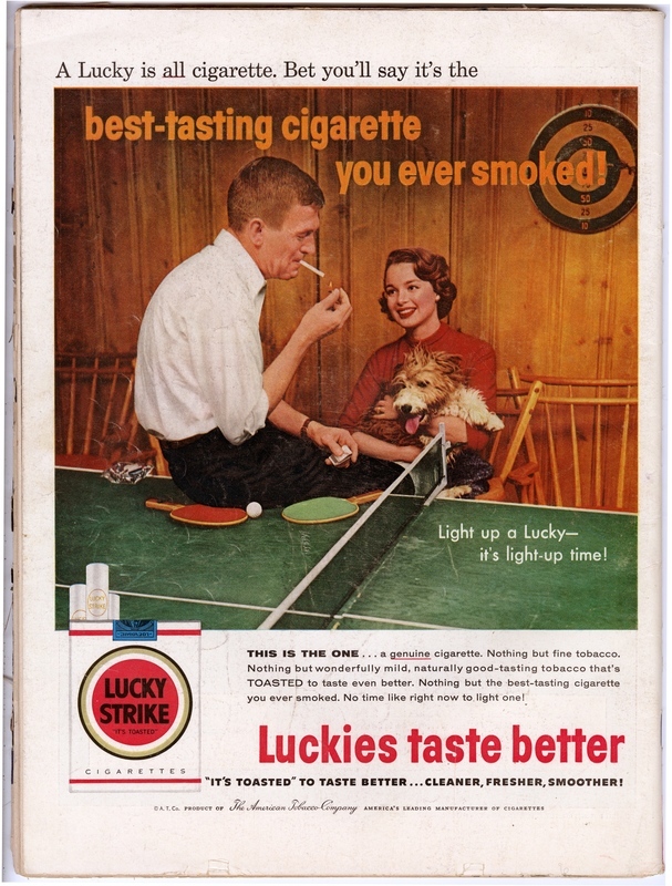
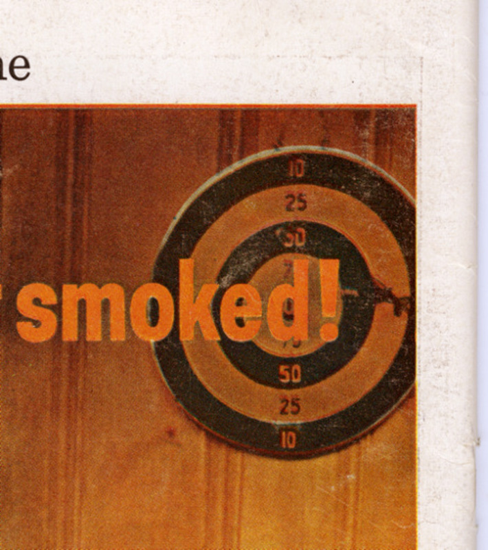
Yet even in high-quality publications like Life magazine–which earned praise in the printing world for the high quality of its color images—the early 1950s ushered in an era of slow decline in terms of registration accuracy. Errors still surface throughout this era, as in an advertisement for Lucky Strike cigarettes. Even when printers assumed that they had hit their target, it was not always so.
While publishers, press owners, and pressroom managers saw the era’s radical technological changes as inevitable signs of progress—and while we today might find a strange beauty in such errors as those found on the page from Gabby Hayes—many craft printers understood the era of high-speed automated web printing as the start of a period of decline. In the 1990s, the folklorist Maggie Holtzberg interviewed dozens of retired printers, who almost universally agreed that the automation of printing in the postwar era saw a rapid decrease in print quality. She records one interaction with a retired four-color pressman:
“Today it’s blah. I don’t enjoy what I see today. During the war I worked in propaganda, four-color stuff. All those colors with perfect register. You know what I mean?”
I nod.
“With perfect alignment. Beautiful. I pick up stuff now and the red is off-line.”
“And do you think that’s because people are in such a hurry?”
“Getting things cheaper here. That eats my heart out. There’s nothing worse than some of these things you get from the Acme people; a bunch of junk. But they’re probably getting it cheap. Printing is not cheap.”
Another printer told Holtzberg that this change in standards had actually transformed the vision of younger printers, making them less sensitive to color registration problems. You have to have an eye,” he said. “Pressmen had to be sensitive. Some people—intelligent kids—you could take two prints, side by side, and they couldn’t tell the difference. Color blindness. There is such a thing as image incapacity.”
Resonances
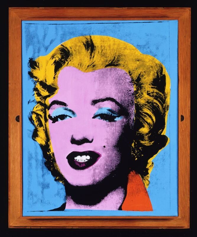
Andy Warhol ya ya ya
